There are lots of enormous flaws at the root of the current effort to evaluate teachers across the US. We could talk about how each teacher serves a much different population, or how the resources which are provided to each teacher are different because of the wealth of their educational community, or how a poor administrator can influence teacher evaluations, but there is a deeper flaw, one based on a more mathematical argument.
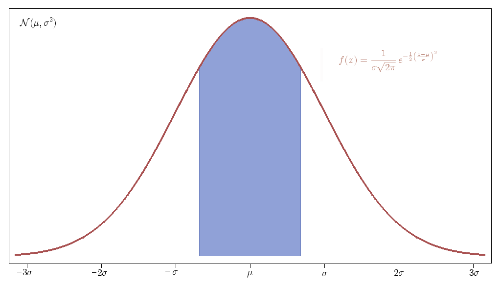
Imagine we ranked all of the teachers according to how much material they covered (which is essentially what grading them using standardized assessment scores from their students do), much like the current SAT system ranks students, and then graphed how many teachers were at each rank. The graph would look very much like the following.

This is called the normal distribution in statistics. The function written at the top doesn’t matter very much. What matters is that μ is the mean (average) of the distribution and σ is what is known the standard deviation (read this explanation if you are confused). μ is measure of where the center of the data is, and σ measures how spread out the data is.
A couple of important facts to know about this graph is that about 68% of the teachers will be within one standard deviation of the mean and that just over 95% of teachers will be within two standard deviations of the mean. This means that the vast majority of teachers will be ranked near the middle of the graph. Teachers within one standard deviation of the mean could be considered average, and teachers ranked below two standard deviations of the mean would be in the bottom 2.3% of the teaching profession. These are the people that typical reform efforts like to target and were recently "exposed" in the LA Times value-added assessment project.
Now let’s suppose we managed to improve the education system in the US a whole bunch. In fact we manage to improve it so that instead of each student learning one years worth of material in a year, they learn two years worth of material! Wow! Good for us! What would happen to the picture above then?
Well it turns out nothing would happen at all. The reason is because the picture above represents a relative ranking between teachers and there will always be teachers who rank lower than other teachers. No matter how much we improve education, the picture above will always remain the same, with one exception. If every teacher was ranked equally, then the picture above would look more like a very thin bar sitting above the mean. I don’t think that will ever happen though and it would certainly be a pretty boring education system. Imagine if students never had a favourite teacher; who would want to join the profession then?
The other point to bring up is that if we supposed that the teachers at the mean of the distribution teach what we call a "year’s worth of material" then as we improved teacher quality and this mean rose, then so would what we defined to be a "year’s worth of material." We’d always be stuck bemoaning the fact that there are teachers who can somehow only cover half a year’s worth of material and other teachers who can cover two year’s worth of material. The amount of material to cover would just rise.
The flaw is that the more material we try to cover each year, the less room there would be for the individuality and creativity which is so important to the teaching profession and to education in general. I’d like to see a slightly different way of assessing teachers. Let’s assess teachers based on their professional relationships with each other, based on the rapport they develop with students, on how willing they are to share their expertise, on the quality of the research they have done, and a host of other factors which cannot be measured by a test, or conveniently broken down into a normal distribution.
Let’s assess each teacher individually.
 This afternoon I had a great conversation with