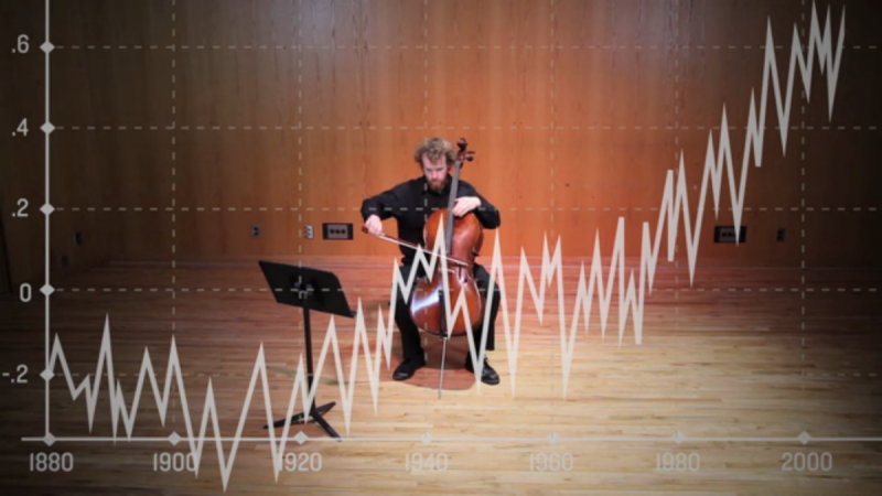
Daniel Crawford is working on an interesting problem; how can we represent data about climate change in other ways. Each note he plays represents the average temperature for a year, with higher pitched notes representing higher temperatures. While I wouldn’t call this piece very musical, it is a very interesting and useful way to represent data about average temperatures.
Once people understand that our world is getting warmer, and significantly so, the next step is to wonder why. I’m interested to see what it would sound like if they overlaid these graphs with graphs of the average parts per million of various gases known to be associated with the greenhouse effect, and played by different instruments.