Schools are awash in data, but have limited ways to visualize and make sense of it. Here we have a distribution of grades for students on a 1 to 7 scale for Grades 7 through 12. It’s useful information and an excellent baseline for the kinds of data services I can offer.
Note that each colour in these graphs represents an IB grade from 1 through 7.
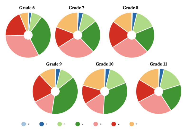
This type of graph is a Sankey chart, and it shows the flow of students’ grades as a single cohort of students progresses from Grade 6 through 12. Notice how each diagram shows both the distribution of grades for a grade level, and where students moved from one score to another as they moved from one grade to another.
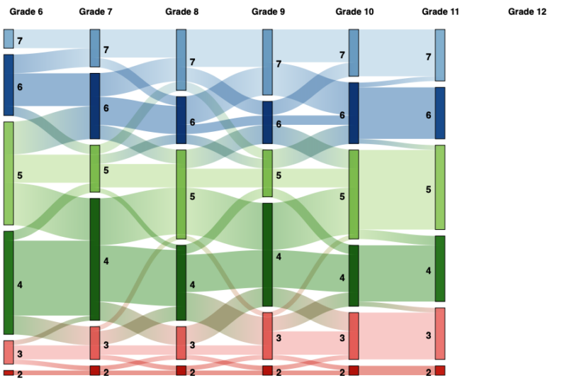
From this Sankey chart, we can see that students who obtain a low score tend to keep that low score, at least for this cohort of students. We can also see that students are less likely to score a 7 in Grade 6 than any other grade. These insights about student performance are obvious when we visualize the data.
Your school may also collect NWEA MAP data or a similar source of external assessment data, but how do those results compare to your internal sources of data? How stable are your results over time?
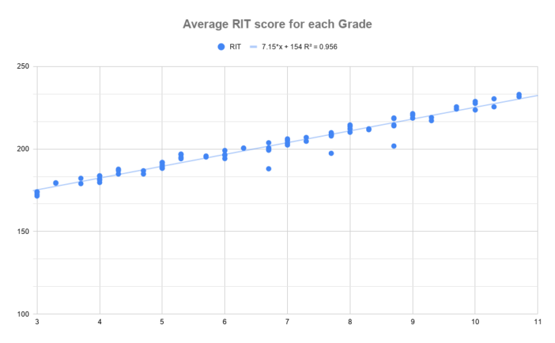
In the chart above, we can see that there is a near perfect fit with the average RIT score for each grade. This means that as students progress, they are learning, on average, a consistent amount.
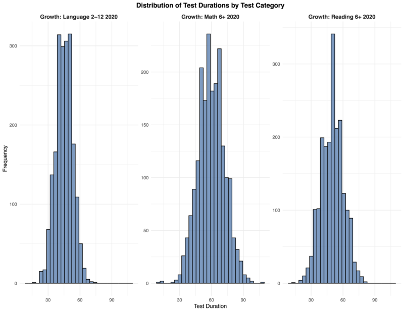
There are also low-hanging fruit from NWEA MAP data that can be highly useful. For example, below are histograms showing the distributions of how long students take to complete the MAP assessments. The pseudo-data below show that almost all students complete the Language 2-12 2020 exam in fewer than 75 minutes, with more than 90% completing it within 65 minutes. By contrast, the Math 6+ 2020 exam is taking 95% of students less than 90 minutes to complete. If you are an administrator of these exams, knowing how long your students take to complete them is crucial for planning purposes.
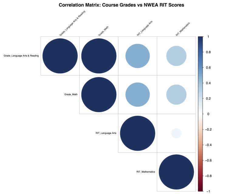
I can also compare your external assessment data with your internal grades for students. This can allow you to determine what factors may influence your grades for students or if there are any hidden areas of concern. This chart shows that for these simulated students, student grades in math are moderately correlated with student scores on their RIT in Language Arts. Knowing this might influence how one teaches mathematics.
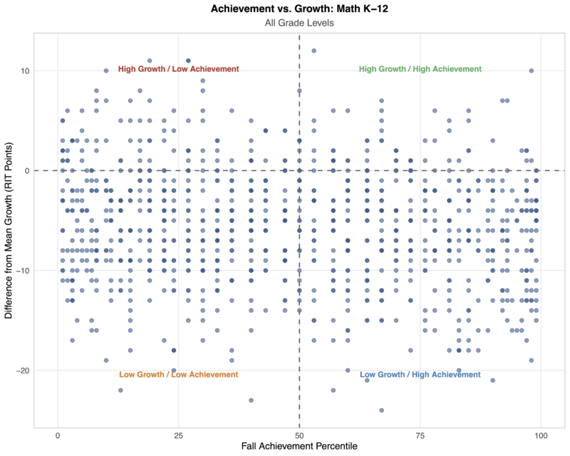
Another thing schools might want to analyze is the relationship, if any, between their absolute achievement of their students and the growth students achieved. Students who had high achievement but low growth may be plateauing (at least relative to the assessment) and too many of these students may point to the need to find an alternative measure of achievement. If this occurs only with a small subset of students, then it could mean that one’s curriculum or instructional practices need investigation.
To investigate this, we can plot students’ achievement as a percentile against the difference between their growth and the average reference growth for all students at that grade level. Here’s an example of what that chart looks like. The graph below shows that most students have lower than expected growth, regardless of their achievement.
Contact me if you want to learn more from your school’s data.