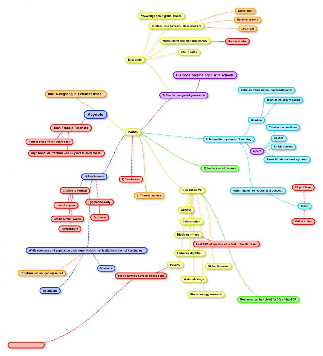
This year’s keynote was awful. The way the presenter talked, the disconnect between what he talked about and what most of us are here for, and the use of his PowerPoint slides was just horrendous. Here’s a mindmap, created by @dwarlick (click on it to open the full image in a new window).
It doesn’t actually seem to me, from viewing this slide, that his actual message is all that bad. Basically, there are huge problems in the world, and the current world structure can’t solve those problems. If I had a captive audience of educators, this might be something I’d like to talk about too. I mean after all, we are going to be educating the future leaders of the world.
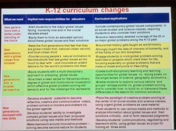
The problem was the way he presented it was totally inappropriate. He used a very poor PowerPoint presentation which he READ from to a room full of people who are easily distracted (because we are teachers) and unimpressed with poor presentation skills. We know how to captivate audiences, and what he did was anything but captivating. Here’s a sample slide, so you understand how bad it was (Thanks @web20classroom).

I’d like to say that the response from the audience, while probably accurately describing his presentation, was a bit harsh. Maybe people on Twitter on the #ISTE10 channel were expressing concern about their own presentations tomorrow. My recommendation to them, don’t follow #ISTE10 during or shortly after your presentation if you have any self-esteem at all and want to keep it. I’d love to have seen a few more supportive folks, but the typical crowd mentality of "okay he’s down now let’s jump on him" cropped up yet again and pretty much everyone was negative. Let’s try and avoid this kind of negativity for each other’s presentations in the next few days, shall we?

Richard Byrne says:
David,
I agree with your statement that we should be a bit less negative when a presentation is going poorly. On the other hand, if you’re presenting a conference full of teachers you should be aware that the audience critiques peoples’ work for a living. Therefore, if you’re presenting at a conference of this type you better bring your “A” game.
Richard
June 27, 2010 — 10:03 pm
David Wees says:
Yeah, definitely. I’m okay with critiques, but the language used was pretty harsh. Can you imagine if that was one of your students up there?
June 28, 2010 — 1:37 am
AtlTeacher says:
The keynote’s backchannel would be perfect for a course in Netiquette Violations 101. What is the purpose of the backchannel anyway? To humiliate? How embarrassing for the profession. If I allowed my students to behave this way, I’d be reprimanded.
June 27, 2010 — 10:06 pm
Derek says:
Your point about people giving talks in the coming days worried about the backchannel is an interesting one. I can see why there might be some worry, but there’s a big difference between a keynote and a concurrent session. The bar is much, much higher for a keynote, especially at such a big conference like ISTE. I would hope that folks on the backchannel would be much more forgiving of their peers giving presentations in concurrent sessions.
June 27, 2010 — 10:42 pm
David Wees says:
I really hope so too. I think they will be, but you never know. Having started a trend of bashing the poor presenter, it could continue. Some of the presentations we will see over the next few days are not going to be good, we should just moderate our response a little bit.
June 28, 2010 — 1:38 am
seanjcl (twitter) says:
i noticed quite a few people leaving, which is a shame. the speaker wasn’t that engaging or charismatic and his PowerPoint stuff was full of “meh” but the underlying message was worthwhile. it was certainly nothing to get worked up over. i wasn’t there to be blown away with an effective Prezi or html5 demonstration; rather, i thought a cerebral start with a guy saying that the big world bureaucracy failed (coming from a guy who was a big time player in it); that nations are failing to provide global solutions; and, that the solution is to come from teachers in classrooms and technology was encouraging. i suppose if you went in hoping to be blown away with bells and whistles then this was a complete letdown, so there’s that.
June 27, 2010 — 11:31 pm
Derek says:
I don’t see a well-designed Prezi or PowerPoint as simply “bells and whistles.” Crafting visuals that complement one’s presentation is an important communication skill. You don’t want your visuals to actually make it more difficult for your audience to understand your message, which is what happened with this keynote it seems. And if you can’t craft effective visuals, then it’s perfectly fine to skip the visuals altogether (no PowerPoint, no Prezi). That’s a better communication choice than using poor visuals.
June 28, 2010 — 9:37 am
Maryna says:
Did people leave because of the presentation style or because of the poor content? If teachers left because of the poor presentation style, they missed an opportunity to learn the content. If they left because of poor content being presented by a captivating speaker, good on them. It is not always about bell and whistles.
June 28, 2010 — 2:11 am
David Wees says:
They really left because it was so difficult to focus on the content because the speaker’s presentation was so poor. It’s unfortunate because like I said, he had a lot of really useful information to share. As someone put it, brilliant man, very interesting information, terrible presentation.
June 28, 2010 — 8:53 am
Steamer says:
Hi, could you please tell me what tool you used to create the mindmap above? Thanks
May 11, 2011 — 6:44 pm
David Wees says:
You’d have to ask David Warlick, he made the mindmap, but I personally like Freemind.
May 11, 2011 — 7:59 pm