Thoughts from a reflective educator.
This graph, taken from Coca Cola's Water stewardship page, presents a very misleading picture on how effectively Coca Cola has improved their water efficiency.

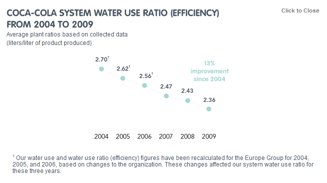
This graph for me highlights an important reason that we need to teach critical analysis of graphs and statistics. Do you see the problem with the graph? (Hint: check the scale of the graph).

David is a mathematics teacher and a learning specialist for technology at Stratford Hall in Vancouver, BC. He has been teaching since 2002, and has worked in Brooklyn, London, and Bangkok before moving back to Canada. He has his Masters degree in Educational Technology from UBC, and is the co-author of a mathematics textbook. He has been published in ISTE's Leading and Learning, Educational Technology Solutions, The Software Developers Journal, The Bangkok Post and Edutopia. He blogs with the Cooperative Catalyst, and is the Assessment group facilitator for Edutopia. He has also helped organize the first Edcamp in Canada, and TEDxKIDS@BC.
Comments
Scales
This is something I tried to highlight with my students while working on graphs this year. They seems to think no matter the graph that counting squares is the way to do it. They are getting there slowly. :)
Post new comment