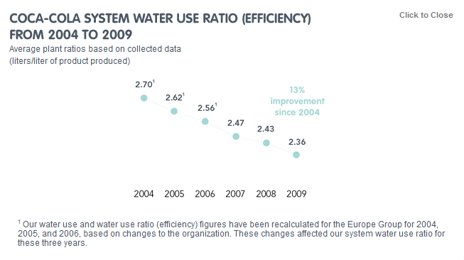
This graph, taken from Coca Cola’s Water stewardship page, presents a very misleading picture on how effectively Coca Cola has improved their water efficiency.

This graph for me highlights an important reason that we need to teach critical analysis of graphs and statistics. Do you see the problem with the graph? (Hint: check the scale of the graph).