I tried something new this when I taught the Chi squared test. Instead of focusing on the formal procedure that one must follow in order to use the test correctly, I focused on what we were actually DOING when we were doing the test. As a result my students understood the test much more easily, and I had far fewer questions about how to actually use the test.
First, we talked about the expected values, starting with the sums of the expected values. See the following table. Here the "Yes" and "No" refer to whether or the particular person being surveyed watches the TV show Glee.
| |
Yes, I watch Glee |
No, I do not watch Glee |
| Male |
|
|
100 |
| Female |
|
|
100 |
| |
120 |
80 |
200 |
Essentially this backwards from where I started normally, with the observed values table, because I wanted students to understand how we construct this table, rather than relying on rote memorization of the formulas for the expected values. I started with this fact, that we have 50% males and females in our data. Hence, I said, if gender is independent of our question about Glee, how many males should we expect to answer Yes to the question about Glee? Students pretty easily came up with 60 males, reasoning that 50% of 120 is 60. I focused their attention on how what they did to get this answer, and then we filled in the rest of the table.
| |
Yes, I watch Glee |
No, I do not watch Glee |
| Male |
60 |
40 |
100 |
| Female |
60 |
40 |
100 |
| |
120 |
80 |
200 |
I then set up an observed values table, and filled in the table used way different numbers. I made sure students understand that the previous table represented the expected survey results if Gender wasn’t a factor in people choosing to watch Glee, but that the following table represented our actual survey results.
| |
Yes, I watch Glee |
No, I do not watch Glee |
| Male |
25 |
75 |
100 |
| Female |
95 |
5 |
100 |
| |
120 |
80 |
200 |
Right away, one of the students said that this second table obviously meant that there was a relationship between Gender and choosing to watch Glee? The reason he gave, "Well those numbers are way off the expected values."
I then asked a really important question. "How much different do they have to be before the results are significantly different than our expected results?"
Students realized that we’d probably want to start by subtracting our two sets of information like so.
| O |
E |
O – E |
| 25 |
60 |
-35 |
| 75 |
40 |
35 |
| 95 |
60 |
35 |
| 5 |
40 |
-35 |
I pointed out that we don’t really care if the difference is positive or negative, since either way the results are "way off" if the difference is big. So we squared the observed minus the expected values to make the answer positive. Note that we haven’t really done much work with absolute value, so I chose to ignore it for this example, which helped make my case for the calculation, but probably needs some discussion.
| O |
E |
O – E |
(O – E)2 |
| 25 |
60 |
-35 |
1225 |
| 75 |
40 |
35 |
1225 |
| 95 |
60 |
35 |
1225 |
| 5 |
40 |
-35 |
1225 |
Next I pointed out that the numbers were too big, and that I wanted to be able to make a comparison between the size of the difference between observed and expected values in one chart with the size of the same type of difference in another chart. Normalization (which is not a word I used with the students) is a useful way to do this, and hence we want to divide by the expected values.
| O |
E |
O – E |
(O – E)2 |
(O – E)2/E |
| 25 |
60 |
-35 |
1225 |
20.42 |
| 75 |
40 |
35 |
1225 |
30.63 |
| 95 |
60 |
35 |
1225 |
20.42 |
| 5 |
40 |
-35 |
1225 |
30.63 |
Someone noticed that this was a bunch of different numbers and that it would be more useful if we had a single number, so I suggested adding up all of these normalized differences. This number, I labelled as Χ2calculated and we had our result. Note that my objective here was not to formalize the calculation, but more to justify the calculation informally, so that the students would feel like the understood what they were doing.
From there the rest of the lesson was relatively easy, we had a discussion about how to compare Χ2 results which led to the table of critical values, and with this table I introduced the notion of degrees of freedom. I didn’t try to explain why the critical values tend to increase with the degrees of freedom or with the significance level, but the students were okay with these additional steps because the initial calculation, and reasons for the calculation made a lot more sense. I was able to talk about the test at a deeper level than I had before, and when the students came time to actually practicing the calculation themselves, they had a lot fewer difficulties than I had anticipated.
One observation a student had was, "Using those list operations you taught us on the calculator sure would make this a lot easier," and a bunch of the students had an "Aha!" moment as they realized why I bothered to show them how to do the list operations on their calculator.
The essential difference in teaching here was using a conceptual framework versus my old method of rote memorization of the process. I think I know which way I’ll try in the future, even with something which seems so mechanical in nature.




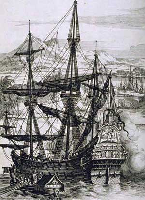 In the 9th grade, our guiding question is, "How as Imperialism affected our society?" and we are looking a specific focus of Central and South America and the colonization of those parts of the world. In Mathematics, my task was, "Determine how much sugar could a galleon carry?" which was relevant because sugar is an example of a trade resource upon which the colonies depended. Here is the task sheet I
 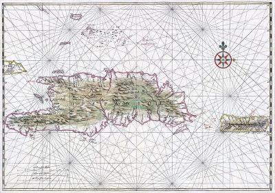 In the 10th grade, our guiding question is, "How do we best get our voice heard? Is it through Science, Math, or Language?" We start by gathering evidence in all three subjects, specifically on the environmental effect of large multinational organization policies can have on small impoverished countries. We complete our week with a trial, in which students will present their scientific or mathematical evidence to their teachers. They will also role-play either French speaking or Spanish speaking people’s of said countries (we originally said that this case was a comparison of the Dominican Republic and Haiti) who have been affected by the multinational organization.